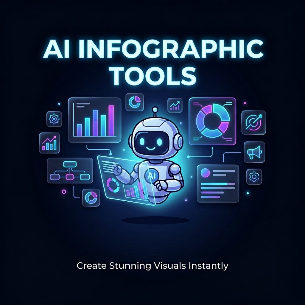
Best AI-Powered Infographic Generators in 2026
Creating a professional infographic used to take a designer, a detailed brief, and half a workday. In 2026, AI-powered infographic generators do it in under 60 seconds — from a text prompt, a spreadsheet, or a PDF you uploaded two minutes ago.
That shift isn’t just about speed. It represents a complete rethinking of who gets to produce high-quality visual content. Marketers, educators, solo founders, data analysts, and content creators are now generating publication-ready infographics without touching design software or writing a single line of code.
But here’s the thing most guides won’t tell you: not all AI infographic tools work the same way, and picking the wrong one for your workflow will cost you more time than it saves. Some tools are built for speed and social media visuals. Others are built for data accuracy and business reporting. A few try to do both — with mixed results.
This guide breaks down every major tool available as of April 2026, compares them honestly across features, pricing, and real-world performance, and tells you exactly which one to use based on what you’re actually starting with. No filler, no generic rankings — just what you need to make a confident decision.
What Is an AI-Powered Infographic Generator? (And How Does It Actually Work?)
Beyond Templates — What AI Actually Does Under the Hood
Most people assume AI infographic tools are glorified template libraries with a chatbot attached. That’s a fair assumption based on the earlier generation of tools — but the leading platforms in 2026 work very differently.
A modern AI infographic generator typically runs a three-step process: it first analyzes your input (text, data, or document), then identifies the most relevant insights or structure, and finally generates a visual layout with appropriate chart types, icons, headings, and data callouts — all without you dragging a single element.
The two primary input modes are worth understanding before you choose a tool:
- Text or topic prompt: You type a subject or paste a paragraph, and the AI builds a full infographic structure around it.
- Raw data input (CSV, Excel, PDF, or Google Sheets): The AI reads your actual data, cleans it, identifies trends, and selects the right visualization type automatically.
The best tools do all three jobs simultaneously — analyze, design, and layout — rather than just placing text on a background. That distinction matters more than any feature comparison table.
The Critical Split: “Look Good Fast” vs. “Data Accurate”
Here’s an insight that almost no competitor guide covers, yet it’s the most important thing to understand about this market in 2026.
AI infographic tools have diverged into two distinct camps. One group — Canva, Adobe Express, Napkin AI — optimizes for visual speed: you get something beautiful in seconds, ideal for social content and quick marketing assets. The other group — Infogram, Powerdrill Bloom, Piktochart AI — prioritizes data fidelity: the numbers in your charts match your source data exactly, which matters enormously when presenting to investors, finance teams, or publishing research.
The reason this split exists is technical and it’s something most creators never think about: text-to-image AI models were trained to make things look right, not to verify that numbers are correct. This creates a very real data hallucination risk — your AI infographic may display approximated, rounded, or in some cases entirely fabricated values that simply look plausible on a chart.
For a social media post, that’s often acceptable. For a board presentation or a published research summary, it isn’t.
If you’re also building out your broader AI toolkit for business decisions, the best AI analytics tools for small businesses in 2026 pair naturally with these infographic workflows — analytics informs the data, infographics communicate it.
The Top AI-Powered Infographic Generators in 2026 (Tested & Ranked)
These aren’t ranked by popularity or affiliate fees. Each tool is evaluated on what it genuinely does best, where it struggles, and who will get the most value from it.
1. Venngage AI — Best for Professional & Business Infographics
Venngage has been a serious infographic platform for years, but its AI layer in 2026 has meaningfully closed the gap between “template tool” and “intelligent design system.”
You enter a text prompt or paste a summary, and Venngage’s AI generates a structured infographic with charts, section headings, icons, and a layout hierarchy — then lets you refine everything in a clean drag-and-drop editor. The Brand Kit feature is where Venngage earns its enterprise appeal: it locks in your logo, fonts, and brand colors across every design, so a team of ten people can all produce on-brand infographics without one person manually re-theming each file.
AI features include: AI Infographic Generator, AI Writing Assistant, AI Image Generator, AI Icon Suggester
Best input type: Text prompts, pasted marketing copy, research summaries
Pricing:
- Free plan: available, but exports carry watermarks and resolution limits
- Business plan: $24/month billed annually — includes 1,000+ image uploads per user, full Brand Kit governance, and the AI Presentation Generator
Pros:
- Best professional template library in its class
- WCAG-compliant exports for accessibility requirements
- Strong for business reports, marketing decks, and HR communications
- Real-time team collaboration built in
Cons:
- Limited AI automation for genuinely interactive or animated infographics
- Free plan exports are low-resolution and watermarked
- Can feel more complex than needed for simple one-off visuals
Best for: Marketers, HR teams, policy analysts, small business owners producing professional reports
2. Canva Magic Studio — Best for Social Media & Raw Speed
Canva is the tool almost everyone starts with, and for good reason. Its Magic Studio suite — particularly Magic Design and Magic Write — makes it the fastest path from “I need an infographic” to a shareable, polished visual.
Magic Design generates layout variations from a short prompt or uploaded content. Magic Write drops AI-generated copy directly into your canvas. The template library covers over 280 infographic formats, and the onboarding is so frictionless you can produce your first design without even creating an account.
AI features include: Magic Design (prompt-to-layout), Magic Write (in-canvas AI copy), Magic Edit (background removal, image expansion, object replacement)
Best input type: Short text prompts, single-concept topics, quick brief summaries
Pricing:
- Free plan: solid starting point, but key assets and Brand Hub are locked
- Pro plan: $12.99/month — unlocks Brand Hub, advanced templates, translation tools, and premium assets
Pros:
- Fastest from prompt to exported visual in any tool tested
- Most accessible onboarding — no design experience required
- Enormous asset library with 800,000+ templates across all content types
- Excellent for social media carousels, marketing graphics, and event flyers
Cons:
- Fixed canvas sizes make long-form or print-optimized infographics difficult
- Weaker for multi-section data-heavy reports — chart customization is limited
- Brand Hub and team governance require a paid subscription
Best for: Social media creators, bloggers, personal brands, marketing teams producing high-volume content
3. Piktochart AI — Best for Data-Driven Storytelling
Piktochart occupies a distinctive position in this market: it’s purpose-built for turning complex information into structured, readable visual narratives — particularly for people who work with documents and data, not just ideas.
Upload a PDF, paste a DOCX, connect a Google Sheet, or just type a topic — and Piktochart’s AI generates a full infographic in seconds. Its AI Outline feature organizes your content into a logical hierarchy before design begins, which eliminates the blank-canvas paralysis that plagues most first-time infographic creators. The Google Sheets integration for real-time data updates is one of the most practically useful features in this entire category — your infographic updates automatically when your data does.
The “Download as Blocks” feature deserves a special mention: it breaks a long infographic into individual sections optimized for social media sizing, which is a genuinely unique workflow advantage that no other tool on this list offers.
AI features include: AI Infographic Generator, AI Outline (content structuring), smart template suggestions based on data format; 800+ template library
Best input type: PDFs, DOCX files, Google Sheets, text blocks, pasted data
Pricing:
- Free tier: available with limited features
- Paid plans: starting at approximately $14/month
Pros:
- Best-in-class for educators, researchers, and data report creators
- Google Sheets live sync keeps infographics current without manual updates
- AI content organization removes the hardest part of starting from scratch
- “Download as Blocks” is uniquely useful for repurposing long content for social
Cons:
- No dedicated desktop or mobile app — browser-only
- Template library is smaller and more specialized than Canva’s
- High-quality templates require a paid plan
Best for: Educators, data analysts, HR teams, academic researchers, nonprofit communicators
4. Visme AI — Best for Interactive & Animated Infographics
If your goal is an infographic that moves — one with animated transitions, interactive hover elements, or cinematic visual storytelling — Visme is the tool built for that use case.
Visme’s AI Designer doesn’t generate infographics from scratch the way Venngage or Piktochart does. Instead, it analyzes your content type (survey results, HR report, product launch brief) and suggests branded template sets with multiple style options. You choose a direction, and the AI customizes it based on your selection. The result is more controlled than fully automated generation, but the output quality for presentation-ready, brand-consistent visuals is consistently high.
The 2D and 3D character library, animated stickers, and transition effects give Visme a content richness that purely data-focused tools can’t match.
AI features include: AI Designer, AI Text Writer (with grammar, clarity, and conciseness assist), AI Image Generator
Best input type: Marketing briefs, presentation outlines, survey data, design specs
Pricing:
- Free version: limited features
- Paid plans: starting at approximately $24.75/month; team and enterprise plans available
Pros:
- Best tool for animated and interactive infographic creation
- Rich 2D/3D character and asset library for creative storytelling
- Strong for agencies and marketing teams managing multiple brand accounts
- AI Text Writer doubles as an on-canvas copy editor
Cons:
- Higher price point than most alternatives
- AI Designer works better for survey/report types than complex raw data charts
- Manual refinement often needed to reach fully polished output
Best for: Marketing agencies, content teams, interactive content creators, brand storytellers
5. Infogram — Best for Embedded & Interactive Data Charts
Infogram takes a different approach to the infographic problem: rather than building standalone downloadable graphics, it specializes in visual content that lives on the web — embedded in articles, blog posts, dashboards, and reports with interactive functionality baked in.
Its AI chart recommendation engine analyzes your data and suggests the most appropriate visualization type. Scroll hover effects, animated data point reveals, and Hover Tooltips (small contextual pop-ups that appear when a reader hovers over a chart element) transform static charts into genuinely engaging web experiences. The direct embedding into websites and blogs with a single code snippet is the most friction-free publishing workflow in this category.
AI features include: AI chart type recommendations, auto-layout adjustment, animated sticker and GIF library, live data source import
Best input type: CSV/spreadsheet imports, live data feeds, real-time APIs
Pricing:
- Free plan: available with core features
- Paid plans: starting at $12.25/month billed annually
Pros:
- Only tool in this list with native, polished interactivity as a core feature
- Live data source connections keep published charts current automatically
- Direct web embed is seamless and requires no design handoff
- Best for journalists, analysts, and publishers producing data stories
Cons:
- Less suited for print-ready or standalone downloadable infographic formats
- Narrower AI automation for full infographic generation compared to Venngage or Piktochart
- Template range skews toward charts and data visualizations, not narrative infographics
Best for: Web publishers, journalists, data analysts, business intelligence teams, editors embedding charts in digital content
6. Napkin AI — Best for Turning Written Content Into Visuals Instantly
Napkin AI solves a very specific problem: you have text — an article draft, a LinkedIn post, a project summary — and you need a visual to go with it. No prompts, no template hunting, no design decisions. Just paste your text, click a button, and Napkin generates diagrams, mind maps, flowcharts, and infographic-style visuals automatically.
What makes Napkin genuinely different is the zero-prompt model. Every other tool in this list requires you to write some kind of prompt or upload a structured file. Napkin just reads your text and decides what visual to generate from it. For project managers, thought leaders, and writers who live in words but need visuals, this is a category-defining workflow.
Exports cover PNG, SVG, PDF, and PPT formats — the SVG export is particularly useful for web use where you need infinitely scalable graphics.
AI features include: Automatic visual generation from raw text (no prompts required), diagram and mind map generation, flowchart creation
Best input type: Articles, essays, LinkedIn posts, project notes, written reports
Pricing:
- Free tier available; desktop-only for creating and editing (mobile is view-only)
Pros:
- Zero learning curve — genuinely no design decisions required
- Fastest from text-to-visual of any tool tested
- SVG export for scalable, web-ready graphics
- Strong for project managers, consultants, and thought leadership creators
Cons:
- Desktop-only for creation (no mobile editing)
- Narrower range of visualization types compared to Venngage or Visme
- Less control over final output aesthetics and brand customization
Best for: Content writers, LinkedIn creators, project managers, consultants, anyone who works primarily in text
7. Powerdrill Bloom — Best for Advanced Data Analysis + Infographics
Powerdrill Bloom occupies a different tier from every other tool in this list. It’s not primarily a design tool — it’s a data intelligence platform with a powerful visualization engine, and if your starting point is raw data rather than a written idea, nothing else comes close.
Upload an Excel, CSV, or PDF file (or just type a topic), and Bloom’s pipeline kicks in: it cleans your data, identifies trends and anomalies, extracts actionable insights, and then generates professionally styled visuals through its Nano Banana Pro visual engine — in Professional, Business, or Fancy output styles, all presentation-ready from the first generation.
The natural language query interface is what sets it apart from traditional BI tools: type “Show me Q4 growth trends from this financial report” and it writes the query, runs the analysis, and produces the chart. That pipeline compresses what used to take three hours (Excel analysis + PowerPoint design) into under a minute.
AI features include: Deep data analysis engine, automated insight extraction, Nano Banana Pro visual engine, natural language data querying
Best input type: Raw Excel, CSV, PDF datasets; financial reports; analytics exports
Pricing: Tiered plans — verify current pricing at powerdrill.ai
Pros:
- Best tool for analysts and data-heavy business users
- Goes beyond “pretty picture” — delivers actionable insights alongside visuals
- Multi-format input with zero manual data cleaning required
- Output is genuinely presentation-ready without additional styling
Cons:
- Steeper learning curve than visual-first tools
- Overkill for simple social media graphics or casual content creation
- Less emphasis on creative brand aesthetics vs. data communication
Best for: Business analysts, financial teams, data-driven marketers, BI professionals, consultants presenting data to clients
Side-by-Side Comparison Table
| Tool | Best For | AI Input Types | Free Plan | Starting Price | Data Accuracy |
|---|---|---|---|---|---|
| Venngage | Professional/business reports | Text prompts, summaries | ✅ (watermarked) | $24/mo | Medium |
| Canva Magic Studio | Social media, speed | Text prompts | ✅ | $12.99/mo | Medium |
| Piktochart AI | Data storytelling, education | Text, PDF, DOCX, Google Sheets | ✅ | ~$14/mo | High |
| Visme | Animation, interactive content | Marketing briefs, design specs | Limited | ~$24.75/mo | Medium |
| Infogram | Embedded web charts | CSV, live data feeds | ✅ | $12.25/mo | High |
| Napkin AI | Written content → visuals | Raw text (no prompt needed) | ✅ | Free tier | Medium |
| Powerdrill Bloom | Deep data analysis + visuals | Excel, CSV, PDF | Tiered | Varies | Very High |
Pricing is verified as of April 2026. Check each tool’s official website for current plans, as AI tool pricing changes frequently.
Real-World Use Cases for AI-Powered Infographic Generators
Understanding which tool to use is half the equation. Understanding when to use any AI infographic generator — and for what specific outcome — is the other half.
Marketing & Content Teams — Scaling Visual Production Without Scaling Headcount
For content marketing teams, the infographic value proposition is clear: infographics earn significantly more backlinks than standard blog posts, and visual content has been documented to increase audience engagement by up to 80%. The problem was always production cost — a custom infographic from a designer takes hours and isn’t cheap.
AI infographic generators change that equation entirely. A content team can now produce infographic summaries of every major blog post, repurpose data-heavy research into shareable visual assets, and turn campaign performance reports into client-ready one-pagers — all without adding headcount or waiting in a design queue.
Venngage and Canva are the natural fits here: Venngage for professional, brand-governed marketing reports, Canva for high-volume social media assets and quick-turn campaign visuals.
For teams also producing video and written content alongside their infographics, pairing this workflow with AI video scripts for YouTube and TikTok creates a complete AI-powered content production system that can keep pace with modern publishing demands.
Education & E-Learning — Making Complex Concepts Stick
Infographics have always been powerful in educational settings — the combination of structured information and visual hierarchy makes complex concepts genuinely easier to retain. AI generators make this accessible to educators who aren’t designers.
Piktochart is the standout tool in this context. Its AI Outline feature structures lecture notes and research summaries into clear, logical visual hierarchies automatically. Dr. Aaron Fischer at the University of Utah noted publicly that Piktochart-created infographics helped his team secure funding by making data accessible to school district administrators and community foundations — an outcome that speaks to the real institutional stakes of clear visual communication.
For educators building broader AI-powered teaching workflows, the best AI platforms for online skill building offer complementary tools for interactive course creation and student engagement.
Small Business & Entrepreneurs — Looking Professional Without an Agency
For solo founders and small business owners, the appeal of AI infographic generators is straightforward: professional-quality visuals at a fraction of the traditional cost, on demand, without waiting for a designer’s availability.
The use cases range from pitch deck data visualizations and investor summaries (Powerdrill Bloom, Piktochart) to branded email newsletter graphics and social media carousels (Canva, Venngage). What makes this category genuinely exciting in 2026 is that tools like Canva’s free tier and Napkin AI’s free plan put production-quality output within reach even before a business has a marketing budget.
If you’re running a small business and using AI tools beyond just design, the best AI analytics tools for small businesses in 2026 are a natural complement — they help you generate the insights that your infographics then communicate.
Data Analysts & Business Intelligence Teams
This is where AI infographic generators deliver their most measurable ROI. A documented real-world case from MindStudio’s 2026 research shows a retail company reducing its monthly reporting cycle from three days to three hours by connecting its point-of-sale system directly to an AI infographic tool. The system generates store performance comparisons, identifies trending products, and flags inventory issues — without manual intervention.
For this use case, Infogram and Powerdrill Bloom lead by a significant margin. Both support live data source connections, which means published infographics update automatically when underlying data changes. For hospital administrators tracking bed occupancy, HR directors monitoring workforce metrics, or financial teams producing weekly performance dashboards, that automation is the difference between a useful tool and a transformative one.
Social Media & Personal Branding
The social media application is where most people first discover AI infographic generators — and it remains one of the strongest use cases, particularly for LinkedIn content creators and visual-first brand builders.
Napkin AI is uniquely suited here: paste a thought leadership article, and it instantly generates a shareable diagram or visual summary ready for LinkedIn. Canva Magic Studio handles everything from Instagram carousels to Pinterest infographics with minimal friction.
For creators building a complete visual identity with AI tools, it’s worth exploring AI art tools for selling prints online and AI tools for making custom avatars — both extend your AI visual toolkit beyond infographics into a full brand presence.
Key Benefits of Using AI-Powered Infographic Generators
Speed: The Most Immediate, Measurable Advantage
The production time comparison is stark and consistent across tools. Traditional infographic creation runs 3–8 hours in the best case: briefing, content organization, design, revisions, export. An AI infographic workflow runs under 60 seconds from prompt to first draft — with refinement adding maybe 20–30 minutes for a polished final version.
Powerdrill Bloom pushes this further: for data-heavy business reports, the platform compresses what used to be a three-hour process (one hour in Excel, two hours in PowerPoint) into under a minute from data upload to presentation-ready visual output.
Accessibility: Design Quality for Non-Designers
Over 14 million people use Piktochart alone — that scale of adoption tells you everything about how meaningfully AI has lowered the barrier to professional visual content creation.
The key mechanism is AI content organization. Tools like Piktochart’s AI Outline and Venngage’s AI layout engine don’t just arrange elements — they make structural decisions: what to emphasize, how to sequence information, which data to visualize vs. which to summarize in text. Those are decisions that used to require design intuition. Now they’re automated.
Brand Consistency at Scale
For anyone managing a brand across multiple team members or multiple clients, the Brand Kit features in Venngage, Canva Pro, and Visme are arguably the most practically valuable AI features in this category.
Your logo, color palette, typography, and branded templates are stored centrally. Every new infographic any team member generates automatically pulls from those assets. What used to require a design review process for brand compliance is now enforced by the tool itself.
Data-to-Visual Automation
Infogram, Piktochart, and Powerdrill Bloom all support live data source connections — CSV/Excel import, Google Sheets sync, or real-time API feeds. When your underlying data updates, your published infographic updates with it.
This transforms infographics from one-time deliverables into living, self-maintaining communication assets. For teams producing weekly or monthly data reports, that automation alone justifies the subscription cost.
SEO and Content Marketing Value
Infographics generate substantially more backlinks than standard written content — a well-documented pattern in content marketing. For SEO-focused content strategies, producing infographic versions of high-performing blog posts is one of the most efficient link-building approaches available.
AI generators make this strategy economically viable. What previously required a custom design investment for each infographic can now be done in minutes, making it feasible to build a visual content layer across an entire content archive rather than just a handful of flagship posts.
Honest Limitations — What AI Infographic Generators Still Can’t Do Well
This is the section most infographic tool roundups skip. It shouldn’t be.
The Data Hallucination Problem — The Most Serious Risk You’re Not Thinking About
Here is the most important technical limitation in this entire space, and almost no one in this market talks about it directly: AI text-to-image models were trained to make data look right, not to verify that it is right.
This means charts generated by visual AI tools can display approximated, rounded, or in some cases entirely invented values that appear completely credible. A bar chart might show 48,000 when your data says 47,284. A percentage might round from 34.7% to 35%. A trend line might get smoothed to look cleaner. These are small errors in isolation — but they compound in business presentations and can be seriously misleading if you don’t catch them.
The solution is architectural. The best AI infographic tools in 2026 separate data processing from visual rendering: a language model processes your data and preserves exact values, then a charting library creates the visualization from those verified numbers. Tools using this approach — Infogram, Piktochart with Google Sheets sync, Powerdrill Bloom — provide traceable, auditable data in every chart. Tools using text-to-image generation for chart creation do not.
Practical rule: If you’re presenting to stakeholders, investors, finance teams, or publishing research, verify every data point in your AI-generated infographic against its source before it leaves your hands.
Limited Creative Originality
AI generators are very good at structure and very average at genuine creative distinctiveness. The outputs from most tools follow recognizable layout patterns — bold stat callouts at the top, horizontal dividers between sections, icon-plus-text rows for list items. That structure is readable and professional, but it doesn’t produce visuals that feel original or brand-specific without significant manual customization.
The human creative layer — brand voice, narrative arc, visual metaphor, emotional resonance — remains outside what any of these tools can reliably deliver. AI handles the scaffolding; you still need to direct the story.
Interactive & Animated Output Is Still Maturing
Outside of Visme and Infogram, meaningful interactivity in AI-generated infographics is still limited in 2026. Clickable elements, scroll-triggered animations, embedded video, and real-time dynamic data views are capabilities users increasingly expect — but they’re not available as default, prompt-driven outputs in most platforms.
The tools that do offer interactivity (Visme, Infogram) require manual configuration of those elements after initial AI generation. Full automation of interactive infographic creation from a single prompt is still an emerging capability, not a current reality.
Privacy and Data Security Risks
When you upload proprietary business data — financial reports, customer data, internal performance metrics — to a cloud-based AI tool, you’re accepting real security risk. That risk is easy to underestimate when the UX is frictionless.
According to a 2025 enterprise survey by Cloudera, 96% of enterprise IT leaders have integrated AI into their processes — but only 31% of those initiatives have reached full production, with governance and security gaps cited as primary blockers. Always review a tool’s data retention and privacy policy before uploading anything sensitive, and check whether your organization’s data governance policies permit use of specific cloud tools.
Copyright and IP Ambiguity
The legal landscape for AI-generated visual content is genuinely unsettled. Over 70 copyright infringement lawsuits were filed against AI companies by late 2025. In March 2025, the U.S. Court of Appeals for the D.C. Circuit confirmed that purely AI-generated images cannot be copyrighted under current U.S. law — meaning if you generate an infographic with no meaningful human creative input, you may not own it in the legal sense.
Adding human creative elements — custom copy, brand assets, manual design choices — strengthens your claim. But if you’re producing AI-generated visuals for commercial use, understanding the IP implications matters. For a current and thorough overview, ethical AI trends every user should know in 2026 covers the legal and governance landscape in practical terms.
Future Trends in AI-Powered Infographic Generation (2026 and Beyond)
Real-Time, Data-Fed Infographics — The Living Dashboard Era
The next meaningful evolution in this space isn’t better-looking templates — it’s infographics that never go stale. The early versions of this exist today: Infogram’s live data connections and Piktochart’s Google Sheets sync already allow published infographics to update automatically when source data changes.
The trajectory points toward infographics that pull directly from APIs, CRMs, point-of-sale systems, and analytics platforms — refreshing in real time without any human trigger. For business teams producing weekly performance reports or retail operations monitoring live inventory, this transforms infographics from periodic deliverables into persistent operational intelligence tools.
Hyper-Personalization — One Dataset, Multiple Audiences
Generative AI makes it technically feasible — and increasingly practical — to produce different versions of the same infographic for different audiences from a single data source.
Imagine a product launch summary that auto-generates an executive overview (high-level metrics, business impact), a detailed analyst version (full data breakdown, trend analysis), and a social media teaser (three key stats, shareable format) — all from the same input. This kind of audience-adaptive content generation isn’t fully automated in any consumer tool yet, but the underlying technology already exists and the leading platforms are building toward it.
Multimodal AI Integration — From Infographic to Full Visual Story
The integration of multimodal large models (text, image, audio, and video in a single pipeline) is actively reshaping what “infographic generation” means as a category. In the next 12–18 months, expect tools that can take a verbal data briefing and return not just an infographic but a synchronized video explainer, a presentation script, and a social media caption pack — all generated together from the same source material.
This is where AI infographic generators start to merge with broader visual content creation platforms, and the distinction between “infographic tool” and “content production platform” blurs significantly.
AI-Human Collaborative Design — The Winning Architecture
The tools that will dominate by 2027 are not the ones with the most automation — they’re the ones that build the best handoff between AI generation and human refinement. The optimal workflow isn’t “AI does everything” or “human does everything with AI assisting marginally.” It’s AI handling structure, layout, data analysis, and first-draft generation, then a human bringing strategic direction, brand narrative, and creative judgment to refine the output.
Every major platform is moving toward this model. The AI handles the parts that are tedious and repeatable; designers and creators focus on the parts that actually require human judgment and creative instinct.
Interactive Infographics as the New Baseline
Static infographics are not disappearing — but they’re already beginning to feel like a legacy format for digital-first audiences. The expectation in 2026 is increasingly for visual content that you can explore: clickable elements that reveal more detail, scroll-triggered animations that guide attention, embedded videos that add context, and data sliders that let readers customize what they see.
Infogram and Visme are the current leaders here. Expect the gap to close across platforms by 2027 as interactivity becomes a standard output mode rather than a premium feature.
How to Choose the Right AI Infographic Generator for Your Needs
With seven strong tools in play, the decision framework matters more than any single recommendation.
Match the Tool to Your Input Type First
This is the most important filter, and it’s the one most guides skip entirely:
- Starting with raw data (CSV, Excel, PDF reports)? → Infogram, Powerdrill Bloom, or Piktochart with Google Sheets integration
- Starting with a written document, article, or PDF? → Piktochart AI or Napkin AI
- Starting with a short text prompt or marketing brief? → Canva Magic Studio or Venngage
- Need animated or interactive output? → Visme or Infogram
- Need deep data analysis alongside your visuals? → Powerdrill Bloom
Your input type is more determinative of tool fit than almost any other factor. A tool that’s #1 for text prompts may actively underperform with raw spreadsheet data — and vice versa.
Assess Your Brand Consistency Requirements
- Solo or personal use: Canva Free or Napkin AI — zero setup, immediate output
- Small team with existing brand guidelines: Canva Pro or Piktochart — Brand Kit at an accessible price point
- Larger teams or agencies managing multiple brand accounts: Venngage Business or Visme — full Brand Kit governance, team permissions, and shared workspace features
Factor in Where the Infographic Will Live
- Social media / quick sharing: Canva, Napkin AI
- Embedded in a blog post or website: Infogram (native embed code, interactive)
- Internal business report or presentation: Venngage, Piktochart, Powerdrill Bloom
- Print or high-resolution download: Visme (PDF/PNG), Venngage
For business teams building a comprehensive AI productivity stack — beyond just infographics — tools like AI email assistants that save hours per week and top AI video editing tools for beginners are natural complements that round out a full AI-powered workflow.
Frequently Asked Questions
What is the best free AI infographic generator in 2026?
Canva’s free tier and Napkin AI offer the strongest free experiences available right now. Canva’s Magic Design generates quick, shareable infographics at no cost, and Napkin AI’s zero-prompt model is uniquely accessible. Piktochart and Venngage also have free plans, though exported files carry watermarks and resolution limits. For data-heavy free use, Infogram’s free tier is the most capable option available without a subscription.
Can AI infographic generators create accurate charts from my data?
Not always — and this is the most important question to ask before choosing a tool. AI visual generation models are trained to make data look correct, not to verify that values are exact. For auditable accuracy, use tools that connect directly to your data source: Piktochart with Google Sheets sync, Infogram with live data import, or Powerdrill Bloom with its data processing pipeline. These architectures preserve your exact values through the visualization process; text-to-image tools do not.
How long does it take to create an infographic with AI?
Most tools produce a usable first draft in under 60 seconds from a text prompt. Document-based input (PDF or DOCX upload) typically takes 10–30 seconds of processing time. Customization — adjusting brand colors, refining copy, tweaking layout — adds 15–40 minutes depending on complexity and how far you want to take the output from the AI’s initial generation.
Are AI-generated infographics copyright-safe to use commercially?
This is a legally evolving question with no simple universal answer. As of 2025, U.S. courts have ruled that purely AI-generated images cannot hold copyright protection. However, the creative elements you contribute — your input content, manual design choices, brand assets — may be protected. Always review each tool’s specific terms of service for commercial use rights, and add meaningful human creative input to strengthen your legal position over the generated output.
Which AI infographic tool is best for small businesses?
Canva Pro at $12.99/month is the most versatile and budget-accessible starting point for small businesses. Venngage Business at $24/month is better for teams that need strong brand governance and professional report templates. For data-driven small businesses that need to visualize analytics or financial data, Piktochart AI offers the best balance of affordability and data visualization capability. The best AI analytics tools for small businesses in 2026 can help you identify the data sources worth visualizing in the first place.
Can AI infographic generators replace a professional graphic designer?
For structured, data-driven, and template-based infographics — increasingly, yes. For original creative campaigns, complex brand narratives, strategic visual storytelling, or any infographic where the concept itself is the differentiator — no. The consensus in 2026 is AI-human collaboration: AI handles speed, structure, and data processing; designers focus on creative direction, brand narrative, and the decisions that require human judgment and strategic context.
What types of infographics can AI generate?
All major platforms support the seven core infographic formats: statistical, timeline, process, comparison, geographic, hierarchical, and informational. Interactive and animated formats — scroll effects, hover interactions, embedded media — are available in Visme and Infogram specifically, though they require more manual configuration than static formats.
Do AI infographic generators work for educational content?
Yes, and Piktochart and Venngage are particularly well-suited. Both offer education and nonprofit pricing (EDU/NPO plans at approximately $10–$14/month) with templates built specifically for classroom materials, academic posters, and grant and funding presentations. For educators building a broader AI-powered teaching toolkit, the best AI platforms for online skill building covers complementary tools for interactive learning content creation.
Conclusion — The Right AI Infographic Generator Changes How You Communicate
AI-powered infographic generators in 2026 aren’t design shortcuts or novelty tools. They represent a genuine shift in who can produce clear, professional, data-driven visual communication — and how quickly they can do it.
The creators, analysts, educators, and business teams who are getting the most value from these tools share one common approach: they matched the tool to their workflow instead of defaulting to the most-marketed name. Piktochart for document-based data storytelling. Infogram for web-embedded interactive charts. Canva for social speed. Powerdrill Bloom when the data complexity demands it.
The tools handle structure, layout, and first-draft speed. You still bring the strategic direction, brand narrative, and human judgment that makes the output actually worth reading.
And before you publish anything to a client, a board, or a public audience — verify the numbers. The data hallucination risk is real, and the best infographic in the room is worth nothing if the chart is wrong.
Ready to build your first AI infographic? Start with a free trial on Piktochart, Venngage, or Canva — each takes under five minutes to get started. If you’re building a complete AI content toolkit alongside your infographic workflow, the AI email reply generator and AI video scripts guide are natural next additions to your stack.
Bookmark this guide — AI tool pricing and features update frequently, and we’ll keep this post current as the market evolves.
Have a tool you’ve tested that belongs on this list? Found a limitation we missed? The comments are open — real-world experience from practitioners makes guides like this better for everyone.